
I need to talk about design tokens, because the way most people explain them is terrible.
Every article starts the same way: a spec definition pulled from some W3C working group, a paragraph about "platform-agnostic design decisions," and then a JSON snippet that tells you nothing about why any of this matters.
I've been building websites for 24 years, and building design systems for the last few years — first informally as a freelancer trying to stop rebuilding the same button for every client, and now at Mediagistic, where I maintain a system across dozens of B2C sites. I've implemented tokens in production, and I've also watched teams drown in token files that were more complicated than the products they were supposed to serve. So let me try this differently.
What design tokens actually are
A design token is a named value for a design decision.
That's it. That's the whole thing.
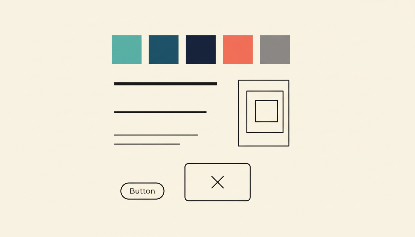
Your brand teal is #20B2AA. Instead of every designer and developer remembering that hex code (they won't), you give it a name: --tks-primary. Now everyone references the name instead of the raw value. When the brand color changes next quarter, you update one place and it ripples everywhere. That's exactly how I set up the CSS for my own site and for every client project — --baron-primary, --hometown-red, whatever the brand needs.
Tokens aren't limited to colors. Spacing, font sizes, border radii, shadows, breakpoints, animation durations -- any design decision that repeats across your product can become a token.
Tokens are the single source of truth for the visual decisions that make your product look and feel like one product instead of twelve.
If you've ever used CSS custom properties (variables), you already understand the core concept. Tokens are that idea taken further -- structured, documented, and shared across platforms and tools.
The real problem they solve
Most explanations say tokens are about "consistency." That's true but incomplete. Consistency is a side effect. The real problem tokens solve is coordination at scale.
When your team is three people, you don't need tokens. You sit next to each other, you use the same Figma file, and when something changes, you say it out loud. Done.
When you're managing 40+ client sites across a team of designers, each building pages in WordPress and Elementor? Now you have a coordination problem. Designer A uses 16px padding. Designer B uses 20px. The new hire sees both and picks 18px because why not. Nobody is wrong individually. Everything is wrong collectively.
Tokens solve this by making design decisions explicit, named, and centralized. Not because naming things is fun -- but because distributed teams can't make consistent decisions without a shared reference point.
The second problem tokens solve is change management. Without tokens, updating your primary color means finding every instance of that hex code across every codebase, stylesheet, Figma file, and mobile app. With tokens, you change one value. That's not a theoretical benefit. That's the difference between a one-hour task and a two-week migration.
The three levels: global, alias, and component
This is where people's eyes glaze over, and I get it. But the layered structure is what makes tokens actually useful at scale, so stay with me.
Global tokens (the raw values)
These are your primitives. The actual values, named descriptively but without any opinion about how they're used.
color-teal-500: #20B2AAcolor-slate-900: #1E2D3Aspace-16: 16pxfont-size-18: 1.125rem
Think of these as your palette. Every color, every spacing value, every type size your system uses. They describe what the value is, not where it's used.
Alias tokens (the semantic layer)
This is where intent enters the picture. Alias tokens reference global tokens but add meaning about purpose.
color-primary: {color-teal-500}color-text-body: {color-slate-900}space-section: {space-16}font-size-body: {font-size-18}
Now instead of a developer wondering "which teal do I use for the main action?" they just use color-primary. The decision is already made. And if you later decide your primary color should be purple instead of teal, you update the alias -- the global teal still exists, the alias just points somewhere new.
This layer is what makes theming possible. Dark mode? Your alias tokens point to different global values. Brand variant for a sub-product? Same structure, different references.
Component tokens (the specific layer)
Some teams add a third layer for component-specific decisions.
button-bg-primary: {color-primary}button-padding-y: {space-12}card-border-radius: {radius-lg}
These are scoped to individual components and reference alias tokens. The advantage is granular control -- you can change what "primary button background" means without affecting every other use of your primary color. The downside is complexity. More on that in a minute.
Common mistakes teams make
Over-tokenizing everything. Not every value needs to be a token. If a value is used exactly once and has no reason to change independently, a token adds overhead without adding value. I've reviewed token files with 600+ entries for products that needed maybe 80. More tokens doesn't mean more systematic -- it means more maintenance.
Bad naming that mirrors the value. If your token is called color-teal-for-buttons, you've defeated the purpose. The name should reflect the role, not the value. When teal becomes purple, color-teal-for-buttons is now a lie. color-action-primary still makes sense regardless of the hex behind it.
Skipping the alias layer. Teams that go straight from global tokens to component tokens (or worse, straight from global tokens to code) lose all the flexibility that makes tokens worth the effort. The semantic layer isn't optional. It's where the actual power lives.
Treating tokens as religion. I've watched teams spend weeks debating token naming conventions while their product shipped with inconsistent spacing and three different button styles. Tokens are a tool. They serve the product. The moment your token architecture becomes more complex than the design problems it solves, you've lost the plot.
Not documenting the decisions. A token file without context is just a spreadsheet. Why did you choose that spacing scale? What's the rule for when to use space-section versus space-element? If the reasoning isn't documented, every new team member will guess -- and they'll guess differently.
When tokens aren't the answer
Tokens are not always the right move. I know that's heresy in design systems circles, but it's true.
If you're a solo freelancer building one site at a time, you don't need a full token architecture. You need to ship. CSS custom properties in a single brand.css file will serve you fine — that's exactly what I did for years before the scale problems demanded more structure.
If your product is a single-platform web app with no theming requirements, the full three-layer token architecture might be overkill. A solid set of CSS custom properties with good naming gives you 80% of the benefit at 20% of the complexity.
And if your team doesn't have the discipline to maintain tokens -- to update them when decisions change, to enforce their usage, to document them -- then tokens will rot. Outdated tokens are worse than no tokens, because they give the illusion of a system while the actual product drifts away from it.
The best token system is the one your team will actually use. Not the one that looks most impressive in a conference talk.
Start here
If you're starting from zero, here's what I'd actually do:
Audit what you have. Before you create a single token, look at your product. Pull every color, every font size, every spacing value. You'll find duplicates, near-duplicates, and values that serve no clear purpose. That audit is your foundation.
Start with color and spacing. These two categories cover probably 70% of the visual consistency problems in most products. Get your color palette and spacing scale into tokens first. Typography next. Everything else can wait.
Build two layers, not three. Start with global and alias tokens. Skip component tokens until you have a clear, demonstrated need for them. You can always add the third layer later. You can't easily remove complexity once it's baked in.
Name for role, not appearance. color-primary, not color-teal. space-content-gap, not space-16 (at the alias level). Your future self will thank you the first time a brand refresh happens.
Document as you go. Every token should have a brief description of when to use it. Not a novel -- a sentence. "Primary action color for buttons and interactive elements." That's enough. The goal is that someone new to the team can read your token file and make correct decisions without asking you.
Enforce usage. Tokens that exist but aren't required will be ignored. Whether it's linting rules, PR review checklists, or Figma library constraints -- build in the guardrails that make using tokens the path of least resistance.
Design tokens are not complicated. The tooling around them can be, the spec discussions certainly are, and the conference talks definitely make them sound like rocket science. But the core idea -- name your design decisions, organize them in layers, change them in one place -- is straightforward.
The hard part isn't understanding tokens. It's having the discipline to keep them useful, the restraint to not over-engineer them, and the communication skills to get your team to actually adopt them.
Start simple. Stay practical. Let the system grow with the problems it needs to solve, not the problems you imagine having someday.